

Dynamic Manga Comic Strip: Control Motion and Contrast
Example preview
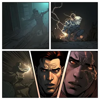
Draft manga-style action with diagonal framing, expressive eyes, bold outlines, and selective detail. Use a restricted palette to keep the important motion readable.
For an energetic strip where composition carries the action. The detailed source prompt suggests dynamic panels, three line weights, a three-color scheme, and negative space; these are visual targets to review.
When to use this template
- A rooftop chase with clear movement direction
- A sports comic built around one decisive movement
- A dramatic reaction where a face anchors the panel
Build your first draft
Define the movement path
Describe where the action begins and ends. Keep that direction consistent across the sequence so diagonal panels support the story.
Choose a visual hierarchy
Name a main color, secondary color, and accent. Reserve the strongest contrast for the subject instead of filling every background with detail.
Inspect the transitions
Check that the action can be followed without the speed lines. Simplify or regenerate a frame when poses or panel borders become ambiguous.
Try a complete example
The rooftop handoff
Create a four-panel dynamic manga strip: a courier sprints rightward along a rooftop, leaps a small gap, reaches a waiting partner, and hands over a bright orange envelope. Black and cream palette with orange accent, diagonal panels, clear silhouettes, limited background detail, bold-to-fine line variation, no text.
The orange envelope links the shots and identifies the payoff. A single movement direction helps readers interpret the diagonal framing instead of being distracted by it.
Before you publish
- The palette and line-weight counts are requests, not measured guarantees; inspect the actual image.
- Avoid overlapping too many speed lines with hands or the prop that explains the action.
Questions about this template
- What makes this different from a standard grid?
- The template emphasizes diagonal composition, cinematic angles, and strong contrast. Use those choices for a scene with motion or emotion rather than simply tilting every panel.
- Must I use three colors?
- The detailed source suggests three colors, but you can change the palette. A limited palette is useful because it separates the subject from the background across a busy sequence.
- How do I improve confusing action?
- Reduce the number of moving subjects, establish their positions, and describe one clear action per panel. More motion lines will not repair an unclear pose.