

All posts
Commercial Storyboard Template: Plan a Video Ad Shot by Shot

Jay
July 15th, 2026
A commercial storyboard turns a marketing idea into something a team can actually produce.
It bridges the gap between the brief and the shoot.
Without it, a commercial can sound strong in a meeting but break down in production. Usually, the issue is not the camera, the editor, or the talent. The issue is that the team never aligned on what the viewer should see, when the product should appear, how the message should build, and what the final call to action should look like.
This is Day 2 of our advertising storyboard series.
Day 1 covered the big picture: what an ad storyboard is and how to plan a commercial before production.
Day 2 gives you a reusable template:
Turn a commercial idea into a shot-by-shot storyboard your team can review.
You can use it for a product video, paid social ad, brand film, launch teaser, explainer commercial, app demo, or a short conversion-focused landing page video.
The goal is not to make every frame beautiful on the first pass.
The goal is to remove guesswork before production starts.
A commercial storyboard template is a repeatable structure for planning a video advertisement.
It usually includes:
The template gives each frame a job.
Instead of writing a loose paragraph like:
Show the product, explain the benefits, and end with a strong CTA.
you create a visual sequence like:
Frame 1: Show the problem in the first two seconds.
Frame 2: Introduce the product as the change agent.
Frame 3: Demonstrate the key feature.
Frame 4: Show proof or transformation.
Frame 5: End with the offer and CTA.
That difference matters.
A paragraph can hide uncertainty. A storyboard exposes it.
Use this template whenever a commercial needs visual clarity before production.
It works especially well for:
The format can also help with non-video ad assets.
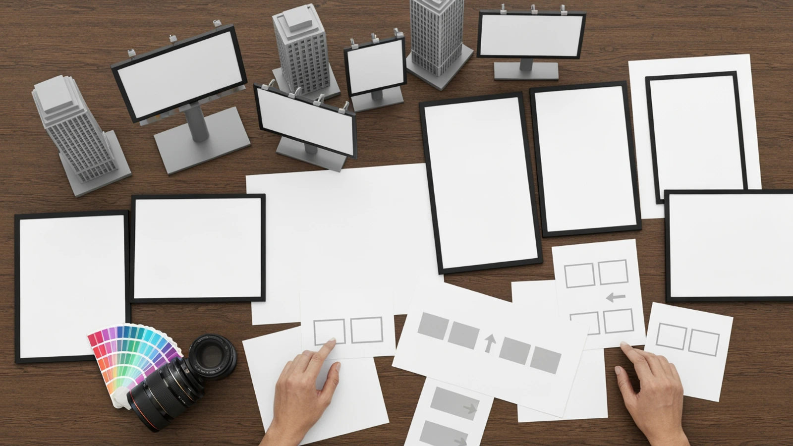
For example, a billboard or static campaign may not need twelve frames, but the same thinking still helps: what does the viewer see first, what is the offer, what is the visual hook, and what should remain in memory after one glance?
Most short commercial storyboards can be built around five beats.
You can adjust the number of frames, but the logic stays useful.
| Beat | Purpose | Typical Timing |
|---|---|---|
| Hook | Stop the scroll or catch attention | 0-3 seconds |
| Problem | Show the viewer's need, pain, or desire | 3-7 seconds |
| Product | Introduce the solution clearly | 7-12 seconds |
| Proof | Show the benefit, result, demo, or social proof | 12-24 seconds |
| CTA | Tell the viewer what to do next | Final 3-6 seconds |
This structure is simple because ads need speed.
Viewers rarely give a commercial unlimited patience. The storyboard has to make the message visible quickly.
Copy this template into your planning doc, creative brief, or LlamaGen storyboard prompt.
| Frame | Time | Visual Action | Camera / Composition | Message Beat | Audio / Caption | Production Note |
|---|---|---|---|---|---|---|
| 1 | 0-2s | Show the viewer's current problem or desire | Strong close-up or clear environmental setup | Hook | Short opening line or silent visual hook | Make the first image instantly readable |
| 2 | 2-5s | Make the problem specific | Medium shot, screen detail, or reaction shot | Problem | Name the pain in simple language | Avoid abstract concepts |
| 3 | 5-8s | Introduce the product or offer | Product hero shot or user interacting with product | Solution | One-line product promise | Product should be visible, not hidden |
| 4 |
For a 15-second ad, compress the template:
| Frame | Time | Purpose |
|---|---|---|
| 1 | 0-2s | Hook |
| 2 | 2-5s | Problem |
| 3 | 5-8s | Product |
| 4 | 8-12s | Proof or benefit |
| 5 | 12-15s | CTA |
For a 6-second ad, reduce it further:
| Frame | Time | Purpose |
|---|---|---|
| 1 | 0-1s | Hook |
| 2 | 1-4s | Product and benefit |
| 3 | 4-6s | CTA |
The shorter the ad, the more ruthless the storyboard must be.
A commercial storyboard frame is not just a drawing box.
Each frame should answer six questions.
Describe the visible action, not the marketing intention.
Weak:
The product feels premium and easy to use.
Stronger:
A founder opens the dashboard on a laptop; the screen shows three clean project cards and one highlighted result area.
The second version can be shot, generated, revised, and approved.
Every frame needs a job.
Possible jobs include:
If a frame does not have a job, remove it.
Commercials need momentum.
If frame 3 and frame 4 show the same idea, the viewer feels repetition. The storyboard should move from confusion to clarity, from problem to solution, or from before to after.
Use this quick check:
Frame 1 shows the problem.
Frame 2 makes the problem specific.
Frame 3 reveals the product.
Frame 4 proves the product works.
Frame 5 shows the better outcome.
That sequence has movement.
Many weak ads hide the product too long.
That can work for a cinematic brand film, but most performance ads need earlier clarity. If the product is not visible by the middle of the storyboard, ask why.
Product visibility can mean:
The product should feel like the reason the scene changes.
Captions and voiceover should not fight the visual.
If the frame already shows a product demo, the caption can name the benefit. If the frame shows the viewer's problem, the voiceover can make the pain feel specific.
Avoid using captions to explain what the image failed to show.
Weak:
This amazing tool saves time and improves workflow efficiency.
Stronger:
Plan the whole campaign before the first shoot.
Specific beats usually work better than generic praise.
Add practical notes:
This is where a storyboard becomes a handoff tool, not just a creative idea.
Here is a complete example for a fictional productivity app.
| Frame | Time | Visual Action | Camera / Composition | Message Beat | Audio / Caption | Production Note |
|---|---|---|---|---|---|---|
| 1 | 0-2s | A marketer looks at scattered notes, half-finished campaign boards, and multiple open tabs | Close-up on messy desk, shallow depth of field | Hook | "Your campaign idea is not the problem." | Keep clutter visual but readable |
| 2 | 2-5s | The marketer tries to explain the ad concept to a team; everyone sees a different version | Medium shot around table | Problem | "The problem is that no one can see the same plan." | Show confused hand gestures |
| 3 | 5-8s | The product appears as the team converts the brief into storyboard frames | Over-the-shoulder screen shot | Product | "Turn the brief into a visual storyboard." |
Notice that each frame has a reason.
The storyboard is not just "show people using the app." It creates a visible argument:
Messy idea -> shared visual plan -> easier revision -> production-ready ad.
That argument is what the viewer remembers.
A creative brief often contains too much information.
The storyboard should not include everything. It should translate the most important parts into visible moments.
Use this extraction process.
Before you make frames, write the offer in one sentence.
This product helps [audience] achieve [outcome] without [pain].
Example:
This tool helps marketing teams plan video ads before production without wasting shoots on unclear concepts.
If the sentence is weak, the storyboard will probably be weak too.
Do not try to show every pain point.
Choose the problem that is easiest to visualize.
Good commercial problems are visible:
Visible problems become stronger openings.
The product moment is where the viewer understands how the solution works.
It might be:
Keep it simple.
The product moment should be understood in one glance.
Proof can be emotional, practical, or visual.
Possible proof frames:
For most short ads, proof should be visible before it is verbal.
The CTA should be planned, not added at the end.
Decide:
A good CTA frame is easy to crop for different platforms.
Use this prompt when you want LlamaGen or another AI storyboard workflow to turn your ad plan into frames.
Create a commercial storyboard for a [15-second / 30-second / 60-second] video ad.

Product:
[Describe the product or offer]

Audience:
[Describe the target viewer]

Main problem:
[Describe the visible problem]

One-sentence offer:
[This product helps X achieve Y without Z]

Ad format:
[TikTok / Instagram Reels / YouTube pre-roll / landing page video / launch teaser / product demo]

Visual style:
[realistic studio photography / cinematic product demo / clean SaaS interface / lifestyle commercial / premium editorial / energetic social ad]

Storyboard requirements:
- Create [5 / 8 / 12] frames.
- Each frame must include visual action, camera angle, message beat, caption or voiceover, and production note.
- Show the product clearly before the midpoint.
- Include a hook, problem, product reveal, proof or benefit, and CTA.
- Avoid generic stock-photo scenes.
- Avoid unreadable UI text, fake logos, watermarks, title banners, and random typography.
- Keep each frame easy to understand at mobile size.
- Leave safe space for captions and CTA overlays.

Output format:
Frame 1:
- Time:
- Visual:
- Camera:
- Message beat:
- Caption or voiceover:
- Production note:
This prompt is intentionally specific.
It tells the AI what the storyboard must decide, not just what the image should look like.
If you need a cover image, do not ask for a poster with text. Text generation often creates fake letters, broken headlines, or unwanted logos.
Use a visual-only prompt:
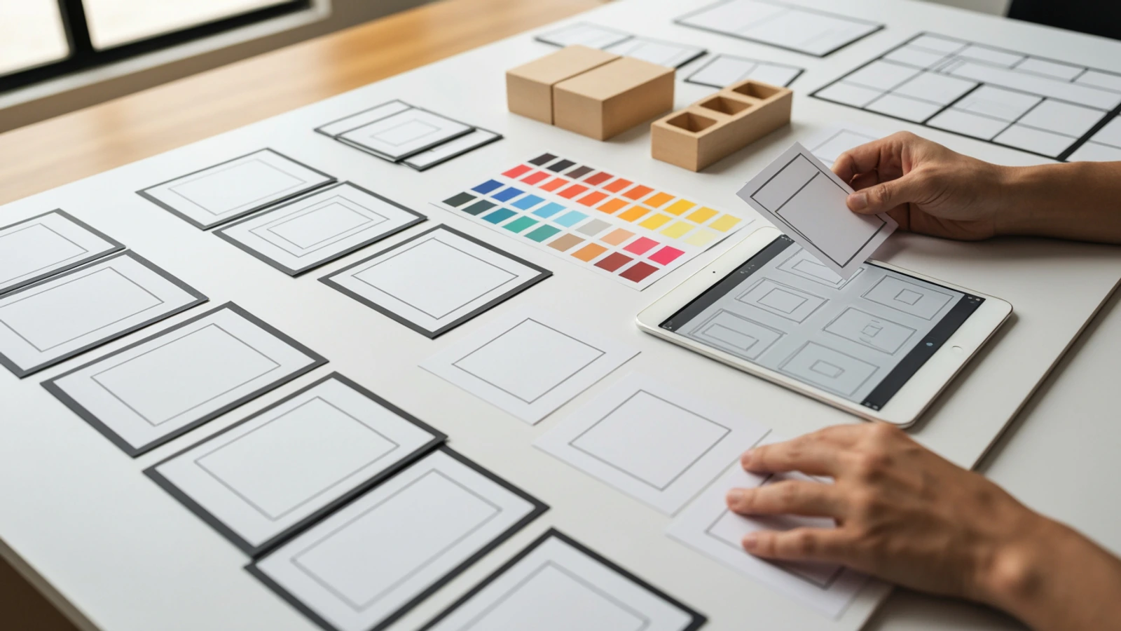
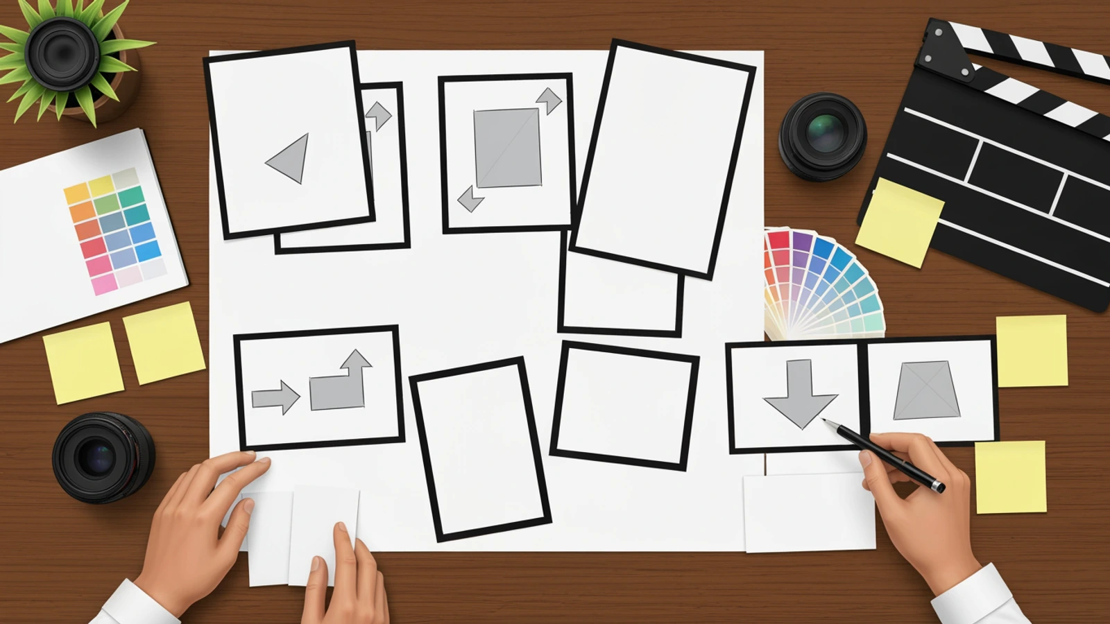
16:9 premium realistic editorial photography, no text and no typography anywhere. A clean advertising pre-production studio table viewed from a slightly elevated angle: blank storyboard cards with simple visual frame sketches, camera angle thumbnails made of abstract marks, color swatches, product mockup blocks with no labels, a tablet showing visual storyboard thumbnails with no readable UI, hands arranging cards for a commercial ad storyboard. Visual story: a loose marketing brief becomes an organized shot sequence. Absolutely no words, no letters, no title banner, no headline, no captions, no logo, no watermark, no barcode, no speech bubbles, no fake interface text. Natural studio light, high-end commercial production mood, crisp details, clean focal hierarchy, responsive crop safe, realistic photography.
The key principles are:
LlamaGen.AI is useful here because commercial storyboarding is a sequential visual problem.
A one-shot image generator can produce a nice hero image, but a commercial usually needs a chain of decisions:
LlamaGen.AI is built around visual storytelling workflows such as storyboards, scenes, panels, character consistency, editable frames, captions, export, and production review. That makes it a practical fit for turning a commercial idea into a frame-by-frame plan.
Start with the storyboard workspace here:
You can also explore the feature page:
Use the commercial template above as your prompt skeleton. Then generate frames, review the sequence, revise weak beats, and export the storyboard for your team.
Before you approve the storyboard, check every item below.
A logo can matter, but it rarely works as the first image unless the brand is already widely recognized.
Start with the viewer's problem, desire, or transformation. Let the logo support the story instead of carrying the whole opening.
A short ad is not a product manual.
Pick the one feature that best proves the promise. If you need to show several features, make a longer demo or a campaign sequence.
Some teams write storyboards that build atmosphere but never clearly show the offer.
That can produce beautiful footage and weak conversion.
For most commercial storyboards, the product should appear early enough that the viewer understands what is being sold.
Avoid notes like:
Make it exciting.
Show success.
Create premium feeling.
Replace them with visible decisions:
Fast push-in on the product as the messy desk becomes a clean shot list.
Customer closes laptop and smiles after approving the final storyboard.
Warm studio light on a finished product beside organized storyboard cards.
Specific images are easier to generate, shoot, and edit.
The CTA frame needs composition.
Plan where text can sit, where the product appears, and what image reinforces the action. A rushed CTA often looks detached from the rest of the ad.
Do not ask the team, "Do you like it?"
That creates vague feedback.
Ask specific questions:
Good review turns opinions into decisions.
Different ad placements need different storyboard choices.
Use a fast hook, close framing, and simple captions. Plan for vertical cropping from the beginning.
The storyboard should make sense even if the viewer watches with sound off.
Show value quickly. If the ad is skippable, the first five seconds must communicate the problem and product direction.
Do not save the product reveal until the final third unless the brand strategy demands it.
You can slow down slightly because the viewer already clicked into context.
Use the storyboard to show workflow, proof, and product details more clearly.
Emotion and anticipation matter more, but the storyboard still needs a visible promise.
Use mystery carefully. Confusion is not the same as curiosity.
When the storyboard is approved, package it like this:
Commercial title:
Objective:
Audience:
Offer:
Duration:
Platform:
Aspect ratios:
Storyboard frames:
Voiceover:
Caption plan:
Product shots:
Location / props:
Brand rules:
CTA:
Export needs:
Open questions:
This handoff helps the team move from creative approval to production without losing the strategic reason behind each shot.
A commercial storyboard template is valuable because it makes the invisible visible.
It turns:
We need a strong product ad.
into:
Here is the hook, the problem, the product moment, the proof, and the CTA.
That clarity saves time, reduces revision loops, and helps creative teams make ads that are easier to produce and easier to understand.
Use the template above for your next commercial.
Then bring it into LlamaGen Storyboard, generate the first visual sequence, revise the weak frames, and turn the plan into a production-ready ad storyboard.
Ülevaade LlamaGeni uusimatest funktsioonidest, tootetäiustustest, disainiuuendustest ja olulistest veaparandustest.
| 8-12s |
| Demonstrate the main feature |
| Over-the-shoulder, hands-on, screen flow, or before/after |
| Feature |
| Explain what changes |
| Use one key feature, not five |
| 5 | 12-17s | Show the benefit in context | Wider lifestyle or workflow shot | Outcome | Benefit caption or voiceover | The viewer should understand the result |
| 6 | 17-22s | Add proof, trust, or comparison | Split scene, review moment, metric card, or customer moment | Proof | Social proof or credibility line | Keep visual proof simple |
| 7 | 22-26s | Repeat the product and emotional result | Clean hero frame | Memory beat | Brand phrase or benefit repeat | This is the frame viewers remember |
| 8 | 26-30s | End with CTA | Product, URL area, app screen, or final brand frame | Action | Clear CTA | Leave enough negative space for final text |
| Screen should be clean and simple |
| 4 | 8-12s | Frames appear: hook, product demo, proof, CTA | Top-down table with storyboard cards | Feature | "Map each shot before production." | Use blank or abstract cards if needed |
| 5 | 12-17s | The team reviews the storyboard and replaces one weak frame | Close-up on hand moving a card | Control | "Revise the ad before you spend on the shoot." | Make iteration visible |
| 6 | 17-22s | The final storyboard sits beside a camera, product sample, and shot list | Hero table composition | Proof | "A clearer plan means a faster shoot." | Strong production mood |
| 7 | 22-26s | Finished ad frames play as thumbnails in sequence | Clean screen grid | Outcome | "From idea to production-ready sequence." | No tiny unreadable UI text |
| 8 | 26-30s | Final brand frame and CTA | Simple product hero frame with negative space | CTA | "Start your storyboard today." | Leave space for CTA overlay |
Soovita lihtsalt oma sõpru, jälgijaid ja kliente ning teeni kuni 30% püsivat komisjonitasu kogu eluks!