A viewer may enter the loop halfway through. They may only see two seconds before a bus blocks the screen. They may catch the final frame first, then the beginning on the next cycle. They may be walking, driving, waiting, or glancing up from a phone.
This is Day 4 of our advertising storyboard series.
Turn a motion outdoor ad into a storyboard that works from any point in the loop.
For digital outdoor ads, the question is not only "Does the first frame work?"
The better question is:
Does every moment still make sense if it is the only moment the viewer sees?
What Is a Digital Billboard Storyboard?
A digital billboard storyboard is a visual plan for a motion-based outdoor ad.
It maps:
The loop length
The opening frame
The main motion beats
The product reveal
The message hierarchy
The final frame
The loop reset
Static fallback frames
Cropped format variants
Readability at distance
Day, night, and glare conditions
Production notes for animation or video export
A normal video storyboard usually assumes the viewer starts at the beginning.
A digital billboard storyboard cannot assume that.
Outdoor viewers often enter the ad mid-loop. That means each beat needs to carry enough meaning on its own while still contributing to the full sequence.
Why Digital Billboards Need a Different Storyboard
A standard online video ad can rely on narrative buildup.
A digital billboard usually needs instant comprehension.
The screen is large, public, and surrounded by noise:
Traffic
Street signs
Reflections
Storefronts
Other screens
Weather
Αρχείο αλλαγών
Άναψε όνειρα για τους νέους Όπου εκατομμύρια ιστορίες ζωντανεύουν
Μια σύνοψη των πιο πρόσφατων κυκλοφοριών δυνατοτήτων του LlamaGen, βελτιώσεων προϊόντος, ενημερώσεων σχεδιασμού και σημαντικών διορθώσεων σφαλμάτων.
✦
✧
✦
✧
Ένα νέο μέσο για Αφήγηση ιστοριών
Δημιουργήστε αμέτρητες ιστορίες, κόμικς, κινούμενα σχέδια, παιχνίδια και άλλα—σε δευτερόλεπτα που αγγίζουν το σύγχρονο κοινό
Pedestrians
Vehicle movement
Bright daylight
Night glare
Motion can help, but it can also hurt.
If the movement is too subtle, people may not notice it. If it is too busy, people may not understand it. If the CTA appears for only one second, many viewers will miss it. If the loop depends on the first frame, anyone who enters late sees confusion.
The storyboard should solve those problems before production.
The Loop Rule
Use this rule for digital billboard planning:
Every second should communicate either the hook, the product, the benefit, or the brand memory.
There should be no dead seconds.
For a 6-second loop, every beat matters. For a 10-second or 15-second loop, you have a little more room, but repeated clarity still matters.
Think of the loop as a circle, not a straight line.
The final frame should connect back to the first frame. The viewer should understand the ad whether they start at second 0, second 3, or second 8.
Recommended Loop Lengths
Your exact timing depends on the media network, placement, and production specs, but these planning structures are useful.
Loop Length
Best For
Storyboard Logic
6 seconds
Fast street screens, transit escalator screens, quick-glance placements
One visual hook, one product beat, one brand memory
10 seconds
City digital billboards, mall screens, event walls
Short sequence with repeated product and brand cues
Do not fill extra time just because it exists.
If a 10-second loop communicates the idea better than a 15-second loop, use the cleaner version.
Digital Billboard Storyboard Template
Use this template when planning a digital billboard, mall screen, transit screen, event wall, or DOOH loop.
Frame
Time
Visual State
Motion
Message Beat
Product / Brand Cue
Readability Check
1
0-1s
Strong visual hook appears immediately
Quick reveal, scale change, or contrast shift
Stop the glance
Brand color or product silhouette visible
Works without reading
2
1-2s
Main object or situation becomes clear
Simple movement, not busy animation
Context
Product or offer enters
Understandable from far away
3
2-4s
Benefit or transformation becomes visible
One clear change
Meaning
Product creates the change
No tiny UI text
4
4-5s
Brand and CTA frame
Minimal movement
Action or memory
Logo area, search phrase, product, URL, or CTA
Large enough to read
5
5-6s
Loop reset frame
Motion returns to hook position
Repeat
Brand memory remains
Final frame connects to frame 1
For a 10-second loop:
Frame
Time
Purpose
1
0-1s
Visual hook
2
1-3s
Problem or context
3
3-5s
Product reveal
4
5-7s
Benefit or transformation
5
7-9s
CTA and brand memory
6
9-10s
Loop reset
For a 15-second loop:
Frame
Time
Purpose
1
0-2s
Hook
2
2-4s
Context
3
4-6s
Product
4
6-9s
Feature or proof
5
9-12s
Outcome
6
12-14s
CTA
7
14-15s
Loop reset
The loop reset matters.
If the last frame cuts awkwardly back to the first frame, the ad feels broken. If the final frame naturally returns to the hook, the loop feels intentional.
The Three Tests for Digital Billboard Motion
1. The Freeze-Frame Test
Pause the storyboard at every second.
Ask:
Does this frame still say something?
Is the product or brand cue visible?
Is the main shape readable?
Does the frame look intentional on its own?
Would this still work as a static fallback?
If a frame only makes sense after watching the previous three seconds, it may be too dependent on linear video logic.
2. The Mid-Loop Entry Test
Start watching at second 3.
Then start at second 5.
Then start at second 8.
Ask:
Can a viewer still understand the category?
Can they identify the product or offer?
Can they remember the brand cue?
Does the CTA appear often enough?
Digital outdoor ads are public loops. People do not wait for the beginning.
3. The Distance Test
Shrink the storyboard or view it from across the room.
Ask:
Does the motion help the eye?
Is the main visual still readable?
Are there too many moving elements?
Does text disappear?
Does contrast survive?
If the storyboard only works at laptop distance, it is not ready for a billboard.
Example: 6-Second Digital Billboard Storyboard
Here is a simple example for an AI storyboard product.
One-glance message:
Plan the ad before the shoot.
Loop goal:
Show a messy campaign idea becoming a clean storyboard sequence.
Storyboard:
Frame
Time
Visual State
Motion
Message Beat
Production Note
1
0-1s
A loose cluster of blank idea cards fills the screen
Cards quickly gather toward the center
Hook: scattered idea
Avoid readable text on cards
2
1-2s
Cards begin snapping into a clean storyboard row
Simple sliding motion
Organization begins
Keep cards large
3
2-4s
The row becomes clear: hook, product, proof, CTA
Smooth alignment
Storyboard structure
Each card uses abstract marks only
4
4-5s
Product or brand cue appears beside the finished row
Subtle scale-in
Memory
Brand area must be readable at distance
5
5-6s
The final row loops back into the first loose card cluster
Gentle reset motion
Repeat
Last frame should connect to frame 1
The concept is simple:
Messy ad idea -> organized shot plan -> repeat.
That is a strong digital billboard loop because the viewer can understand the transformation even if they miss part of it.
Example: 10-Second Retail Screen Storyboard
Retail screens allow slightly more detail because viewers may be walking more slowly or browsing nearby.
One-glance message:
Turn your campaign idea into a visual plan.
Storyboard:
Frame
Time
Visual State
Motion
Message Beat
Production Note
1
0-1s
A blank storyboard frame expands from the center
Scale-up
Hook
Keep the frame clean
2
1-3s
Four empty frames appear in sequence
Sequential reveal
Planning structure
No fake text
3
3-5s
Abstract product moment appears in one frame
Simple highlight
Product
Avoid small UI screenshots
4
5-7s
The frames become a complete visual flow
Left-to-right motion
Benefit
Make the sequence obvious
5
7-9s
Brand cue and CTA area appears
Gentle fade
Action
CTA area must be large
6
9-10s
The sequence compresses back into one blank frame
Reset
Loop
Connect to frame 1
This is different from a video commercial.
The storyboard does not rely on dialogue, tiny captions, or a long narrative. It uses motion to make the idea easier to understand.
What Motion Should Do
Motion on a digital billboard should have a job.
Good motion can:
Attract attention
Reveal the product
Show transformation
Guide the eye
Clarify sequence
Create rhythm
Make the final frame memorable
Connect the loop
Weak motion often:
Adds decoration without meaning
Moves too many objects at once
Makes text harder to read
Hides the product
Creates a busy screen
Depends on sound
Breaks the loop
Use this rule:
One main motion idea per loop.
For example:
Cards snap into a storyboard row.
A product grows from small to large.
A messy desk becomes clean.
A city block lights up around one product.
A before-and-after split opens.
A route line draws across a map.
If every object moves differently, the viewer does not know where to look.
Text and CTA Rules for DOOH
Text on digital outdoor screens needs to be bigger and simpler than text on a phone.
Use these rules:
Keep the headline short.
Avoid multi-line explanations.
Do not animate text too quickly.
Do not place text on a busy background.
Keep the brand or CTA visible long enough to register.
Keep the CTA realistic for the placement.
Use a search phrase or simple URL only if it is readable.
QR codes can work in high-dwell placements, but they are often weak for fast-moving screens.
Ask:
Is the viewer close enough?
Do they have time to scan?
Is the screen stable enough?
Is the QR code large enough?
Is there a fallback search phrase?
For many digital billboards, brand memory matters more than direct scanning.
Static Fallback Frame
Every digital billboard storyboard should include a static fallback.
Why?
Some media networks request static backups.
A screen may freeze on a frame.
A social preview may use one image.
Internal reviews often start with stills.
The strongest still can become a campaign asset.
Choose the frame that best communicates:
Hook + product + brand memory.
If no single frame can do that, the loop may be too dependent on motion.
Digital Billboard Storyboard Prompt
Use this prompt when you want LlamaGen or another AI storyboard workflow to plan a digital billboard loop.
Create a digital billboard storyboard for a motion-based outdoor advertising loop.

Product or offer:
[Describe the product]

Audience:
[Describe the viewer]

Placement:
[Digital city billboard / mall screen / transit platform screen / elevator screen / airport display / event wall]

Loop length:
[6 seconds / 10 seconds / 15 seconds]

One-glance message:
[The one idea viewers should understand]

Visual hook:
[Describe the main visual idea]

Motion idea:
[Describe the one main motion transformation]

Brand cue:
[Logo area, product shape, brand color, app icon, URL, search phrase, or memory device]

CTA:
[Visit / search / scan / start / remember / none]

Storyboard requirements:
- Create frame-by-frame beats with timecodes.
- Each frame must include visual state, motion, message beat, product or brand cue, readability check, and production note.
- Make the loop understandable if a viewer enters halfway through.
- Include a loop reset frame.
- Include a static fallback frame.
- Keep text minimal and readable from distance.
- Use one main motion idea.
- Avoid tiny UI, fake logos, fake text, watermarks, crowded graphics, and decorative motion.
- Include notes for day, night, glare, and cropped format variants.

Output format:
Frame 1:
- Time:
- Visual state:
- Motion:
- Message beat:
- Product / brand cue:
- Readability check:
- Production note:
This prompt pushes the storyboard to think like outdoor media instead of online video.
Image Prompt for a Digital Billboard Storyboard Cover
For a blog cover or concept visual, avoid asking the image model to generate text on screens.
Use blank screens and abstract marks instead:
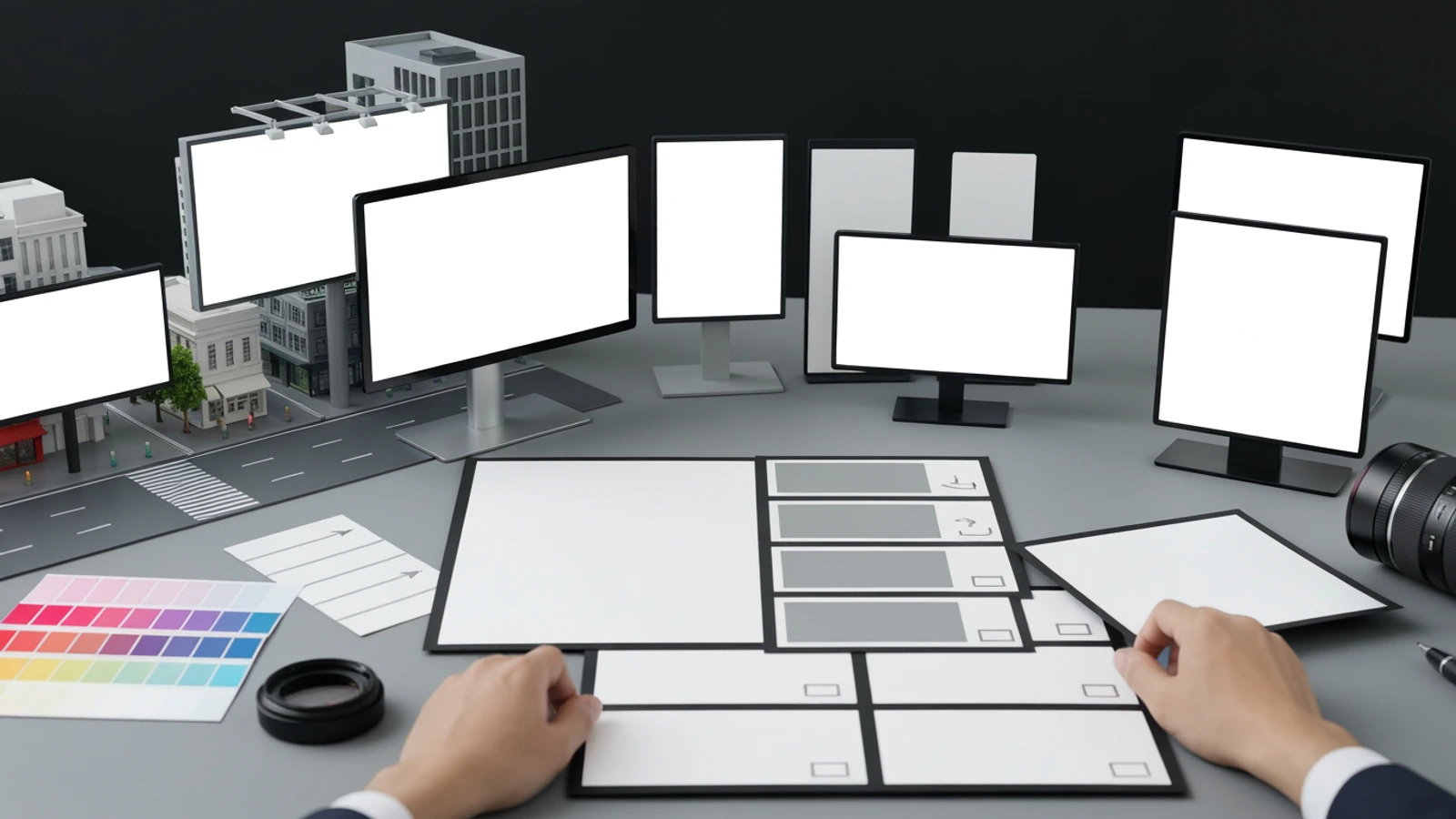
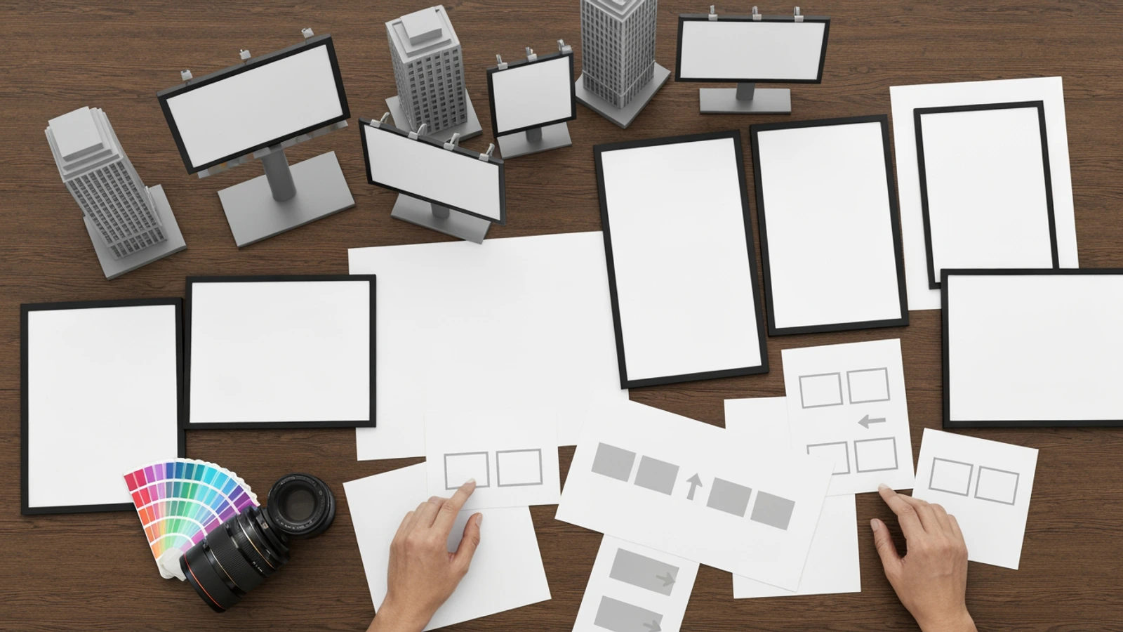
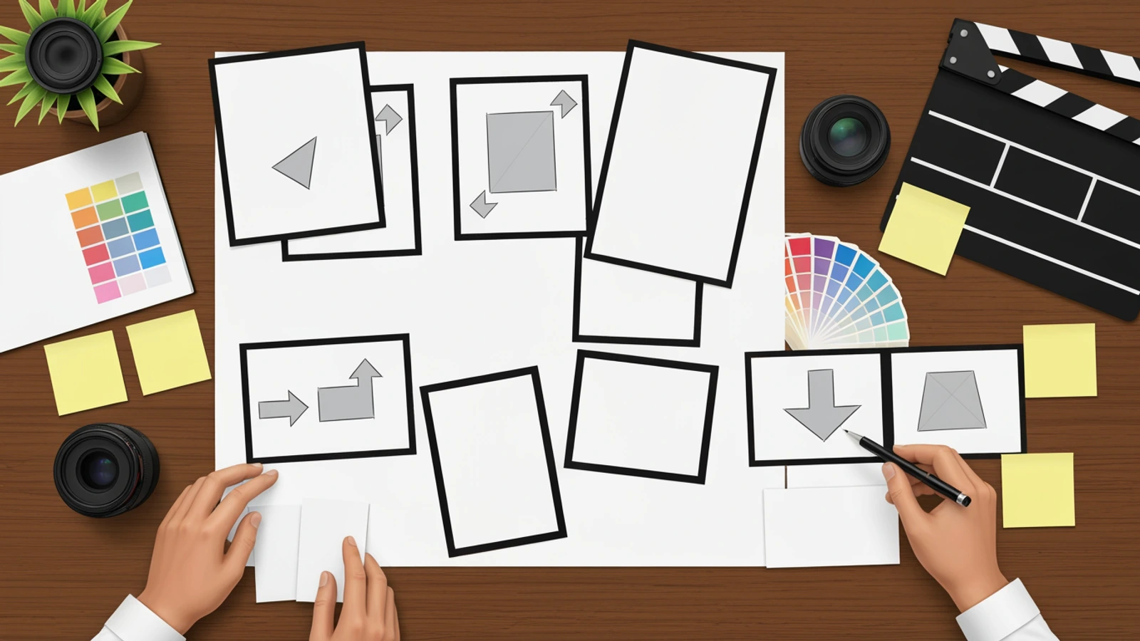
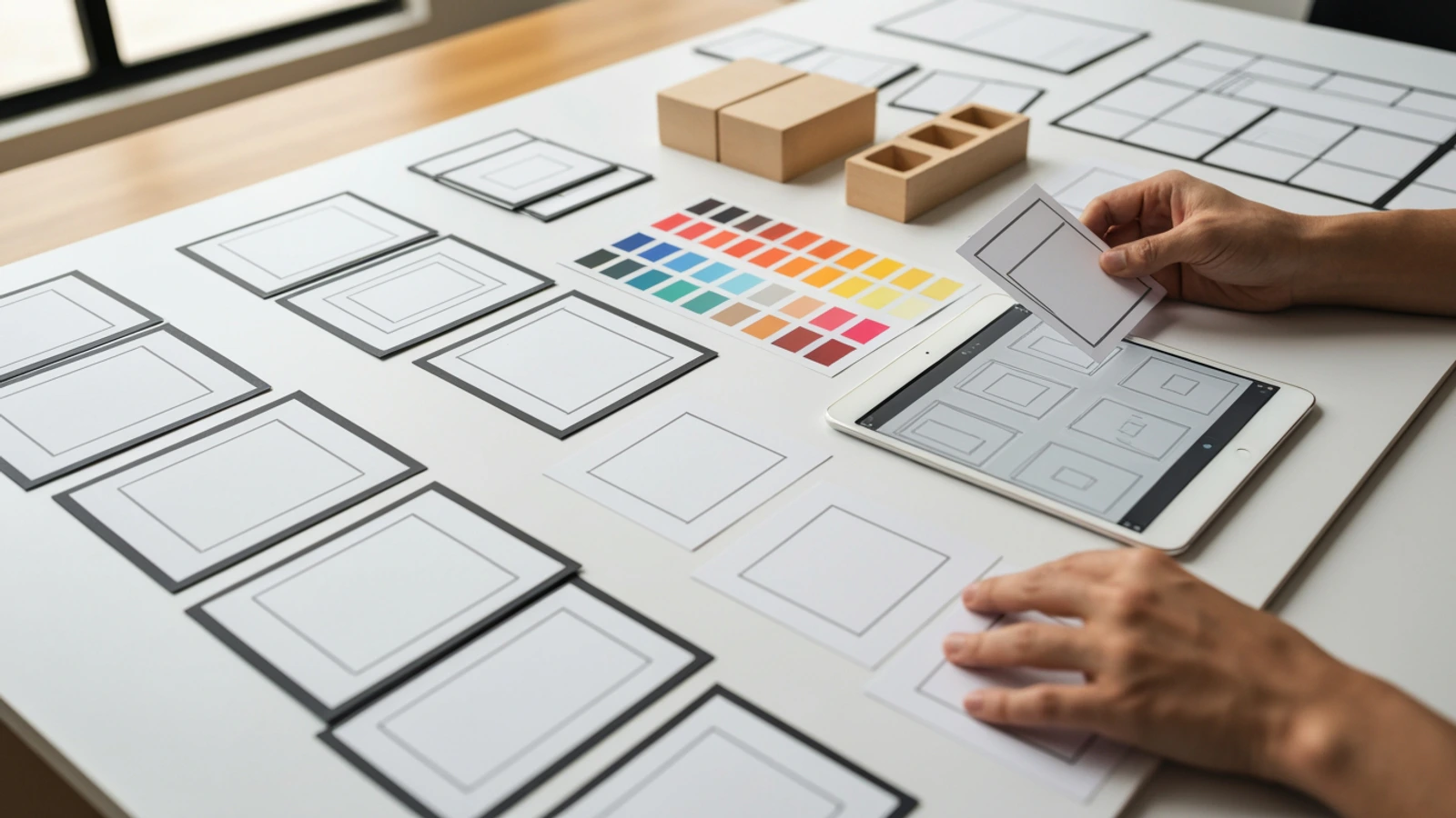
16:9 premium realistic editorial photography, no text and no typography anywhere. A high-end advertising agency table for planning a digital billboard storyboard: miniature city street model, blank digital billboard screens, blank vertical mall display mockups, clean motion storyboard cards with simple gray rectangles and arrows, camera lens, color swatches, hands arranging loop timing frames. The scene shows planning a motion outdoor ad loop before production. Absolutely no words, no letters, no numbers, no punctuation, no logo, no watermark, no title overlay, no captions, no barcode, no fake UI, no readable writing on any object. Natural studio light, realistic materials, crisp details, clean focal hierarchy, premium DOOH pre-production mood, responsive crop safe.
The key lesson from this series:
Do not ask for headline text in generated cover art.
Ask for blank mockups.
Specify no letters, no numbers, no symbols, no logos, and no watermarks.
Make the visual subject specific to the article.
Inspect the final image before syncing it to all locales.
How LlamaGen Fits the Workflow
Digital billboard planning is a storyboard problem because the ad is a sequence of visual states.
You need to plan:
The hook
The motion
The product reveal
The brand cue
The CTA
The loop reset
The static fallback
The placement variants
LlamaGen.AI is useful here because it supports sequential visual workflows: storyboards, scenes, panels, editable frames, captions, consistent visual direction, export, and production review.
Instead of trying to generate one finished billboard, plan the loop as a set of reviewable frames:
Use the prompt above, generate the first frame sequence, then test whether the loop still works when viewed from the middle.
Digital Billboard Storyboard Checklist
Before approving a digital billboard storyboard, run this checklist.
Loop Logic
The loop length is defined.
The first frame works immediately.
The final frame connects back to the first frame.
A viewer can enter halfway through and still understand the ad.
There are no dead seconds.
The product or brand cue appears more than once or stays visible long enough.
Motion
The loop has one main motion idea.
Motion helps comprehension.
Text does not move too quickly.
The product is not hidden by animation.
The loop does not feel visually busy.
The static fallback frame is strong.
Readability
The main visual is readable from distance.
Important text is short and large.
Contrast works in daylight.
Contrast works at night.
The ad survives glare or reflections.
Cropped variants still make sense.
Production
Required screen sizes are listed.
Duration and file specs are known.
Static backup frame is chosen.
CTA and QR decisions match placement behavior.
Brand colors and safe areas are noted.
The production team knows which frames require motion design.
Review
The team tested the freeze-frame read.
The team tested mid-loop entry.
The team tested distance.
The team reviewed the ad in environment mockups.
Stakeholders approved the loop, not only one still frame.
Common Digital Billboard Storyboard Mistakes
Mistake 1: Making a Mini Video Ad
A digital billboard is not the same as a YouTube pre-roll.
It may not have sound. It may not be watched from the beginning. It may be seen from far away. It may be surrounded by competing screens.
Storyboard for outdoor behavior, not online viewing behavior.
Mistake 2: Too Much Motion
Motion is not automatically attention.
Too much movement can make the ad unreadable. Choose one main motion idea and let everything else support it.
Mistake 3: Tiny Product or Tiny UI
If the product is small, the viewer may never understand what is being advertised.
Avoid small interface screenshots unless the placement is close and high-dwell. Use large product shapes, simplified screens, or abstract workflow visuals instead.
Mistake 4: CTA Appears Too Briefly
If the CTA appears for only one second, many viewers will miss it.
Keep the final action or brand cue visible long enough to register, and consider repeating it across the loop.
Mistake 5: Bad Loop Reset
A harsh cut can make the ad feel broken.
The storyboard should plan how the final frame returns to the first. A smooth reset can make the loop feel polished and intentional.
Placement Notes
Digital City Billboard
Use large shapes, strong contrast, and simple motion. The viewer may be far away or moving quickly.
Mall Digital Screen
You can use slightly more detail, but do not overload the screen. Retail environments already contain visual noise.
Transit Platform Screen
Viewers may have dwell time, but the platform can be crowded. Use a clear loop and a strong static fallback.
Elevator Screen
The screen is close but small. Use simple motion, short copy, and a CTA that can be understood quickly.
Airport Display
Viewers may be waiting, but the environment is full of competing information. Make the brand cue clean and the message calm.
Event Wall
The screen may be large and high-impact. Plan motion that feels premium and readable in photos or video capture.
How to Present a Digital Billboard Storyboard
Present the storyboard as a loop, not only a grid of stills.
Use this review sequence:
Campaign objective
Placement and loop length
One-glance message
Frame-by-frame storyboard
Mid-loop entry test
Static fallback frame
Environment mockup
Cropped variants
Production notes
Ask specific questions:
Can you understand the ad if you start at second 4?
Which frame is the strongest static fallback?
Is the product visible enough?
Does motion clarify or distract?
Does the CTA stay visible long enough?
Does the final frame reset cleanly?
This keeps feedback practical.
Production Handoff Format
When the storyboard is approved, package it like this:
Campaign title:
Objective:
Audience:
Placement:
Loop length:
Aspect ratio:
One-glance message:
Main visual:
Motion idea:
Frame timings:
Product / brand cue:
CTA:
Static fallback frame:
Day / night notes:
Crop variants:
File specs:
Open questions:
This handoff helps the creative team, motion designer, media buyer, and client stay aligned.
Final Takeaway
A digital billboard storyboard is a loop design tool.
It turns:
Let's animate the billboard.
into:
Here is the hook, the motion, the product beat, the CTA, the reset, and the frame that still works if the screen freezes.
That is the difference between motion that looks decorative and motion that helps people understand the ad.
Use the template above to plan your next digital billboard or DOOH campaign. Then bring the loop into LlamaGen Storyboard, generate the visual sequence, test mid-loop entry, choose a static fallback, and hand off a cleaner outdoor motion storyboard.