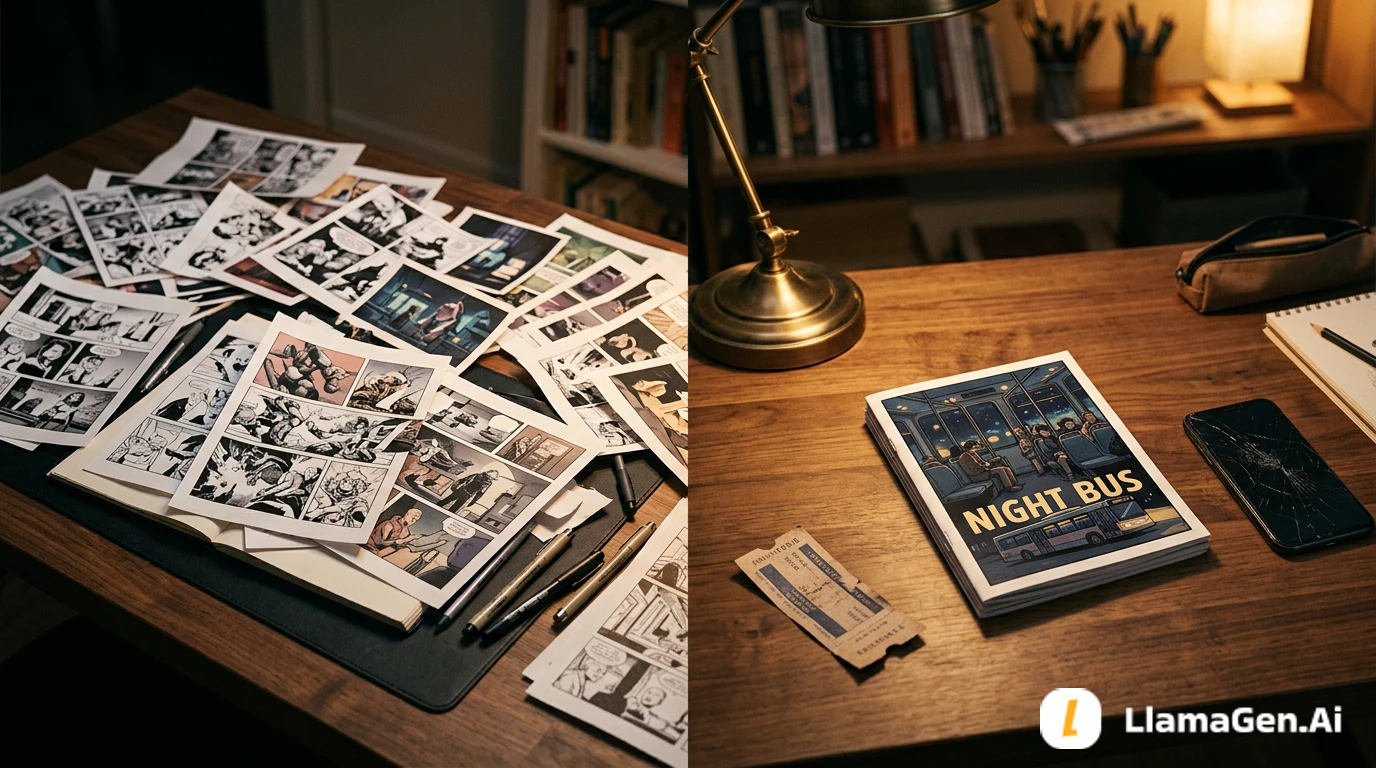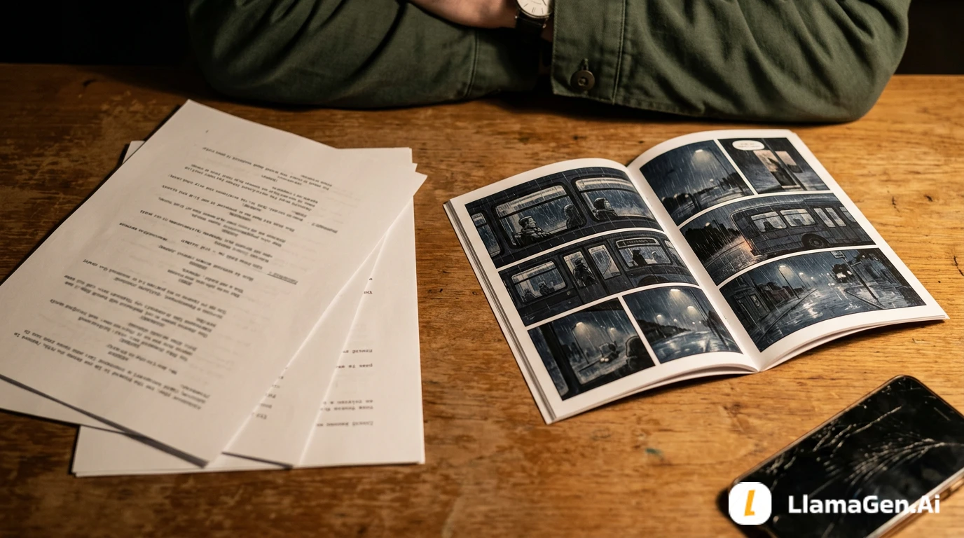

A comic page is not just a grid of nice images. It is a reading path.
A good panel layout answers four questions:
Where does the reader look first?
What changes in each panel?
Where can text sit without covering the story?
How fast should the reader move?
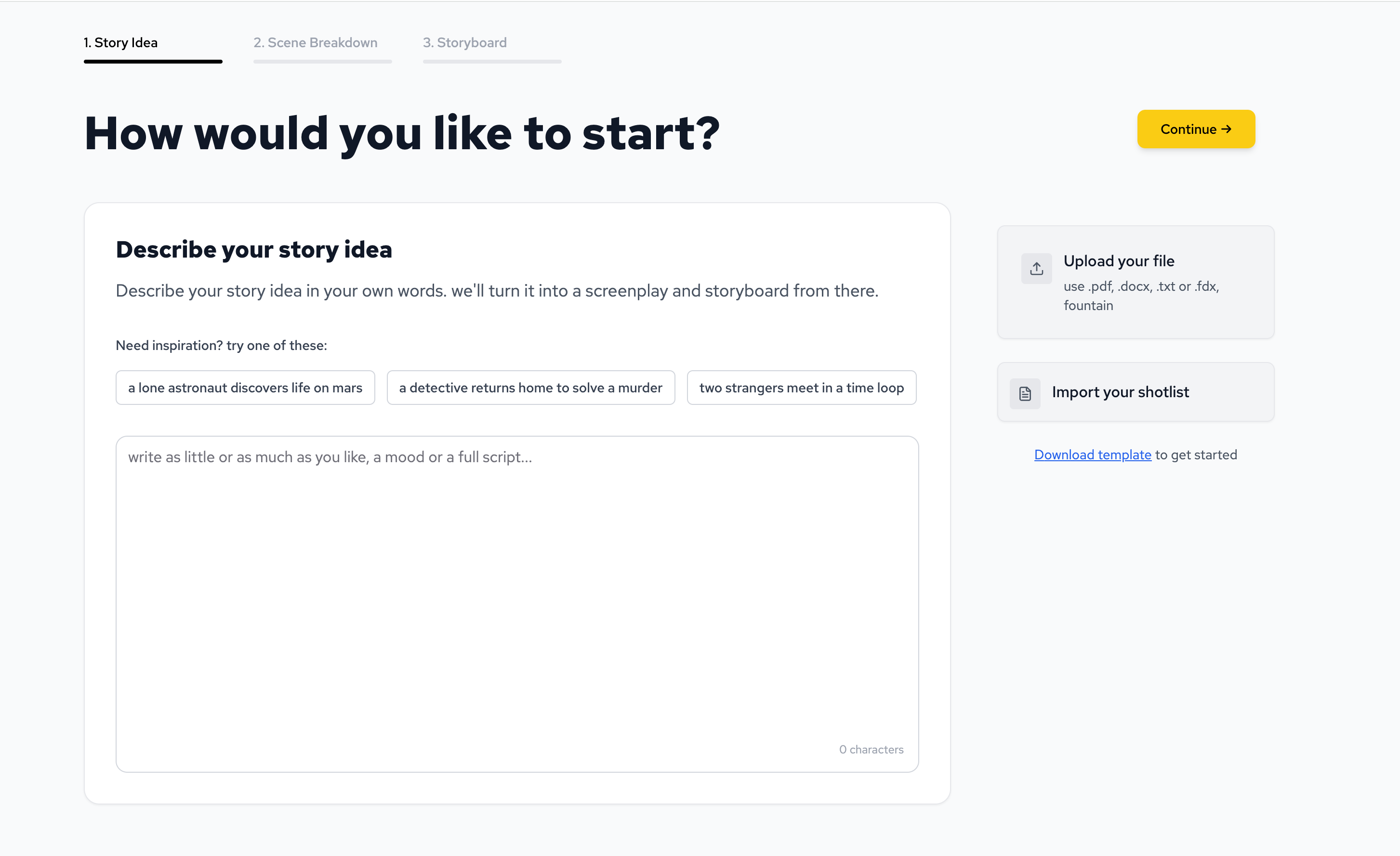
If you are new, start with the LlamaGen.AI AI storyboard generator. Plan the beats first, then turn the approved layout into comic panels.
Many early comic pages fail for practical reasons:
The fix is usually not more detail or decoration. It is a clearer layout plan.
This test used the same short comic project as the character consistency checklist.
| Test item | Setup |
|---|---|
| Date tested | August 10, 2026 |
| Project | Moon Gate Delivery |
| Source input | 1 scene, 2 characters, 1 supernatural location |
| Creator stage | After character lock file, before final comic generation |
| Target output | Beat map, thumbnail layout, panel prompt, repair checklist |
| Active editing time | About 16 minutes |
| Total elapsed time | About 38 minutes including one failed layout pass |
| AI/editorial model note | CMS editorial review used GPT-5.4; product model and credit cost can vary by workspace settings and output type |
| Credits / cost note | Treat this as a workflow test, not a pricing benchmark |
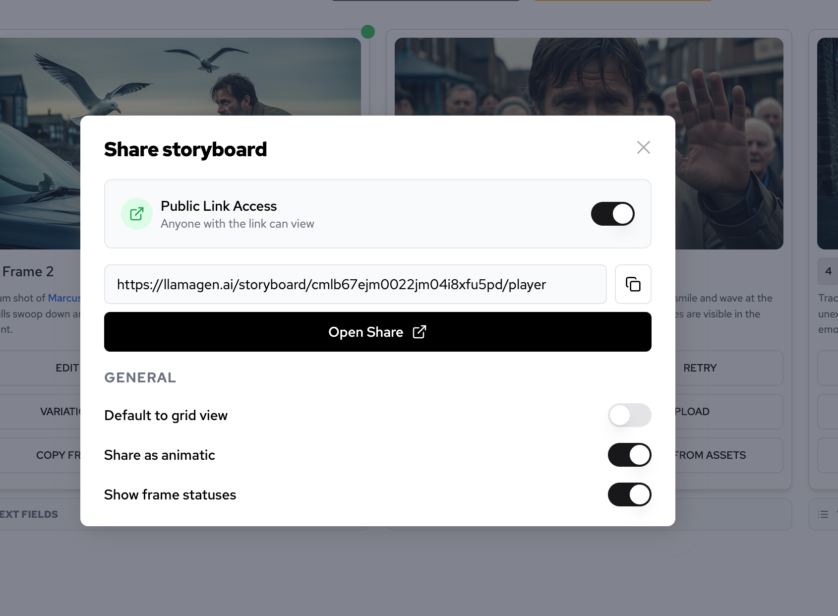
These product surfaces are useful for moving from story beats to visual sequencing.
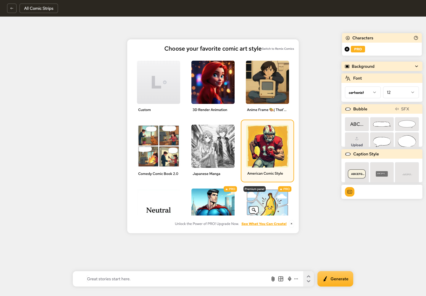
The test question was:
Can a beginner turn one scene into a readable page before generating final art?
This was the layout test:
Nia, a bicycle courier, reaches an abandoned train station after midnight.

She carries a sealed silver envelope. A stray station cat follows her through the ticket gate. The platform is empty, but the old arrival board turns on by itself.

The board does not show a train. It shows Nia's name and the word "Tomorrow."

Nia looks at the envelope. The seal has changed into the same symbol as the board.
This is enough for one page. The layout decides what the reader discovers first.
Pick the format before you pick the panel count.
A rundown of the latest LlamaGen feature releases, product enhancements, design updates, and important bug fixes.
| Format | Best for | Beginner layout |
|---|---|---|
| 4-panel strip | Short joke, simple twist, social post | 2x2 grid or vertical stack |
| 6-panel page | Short scene with setup and reveal | Mixed panel sizes with one wide establishing shot |
| Manga page | Dramatic pacing and close-ups | Strong black-and-white rhythm, varied panel scale |
| Webtoon episode | Scroll rhythm and emotional pauses | Vertical panels with breathing space |
| Storyboard | Planning before comic or video | One beat per frame, clear camera notes |
For this test, I used a six-panel page. It is long enough for atmosphere, action, and reveal, but short enough for beginners to control.
Do not split by sentence. Split by story change.
Convert this scene into 6 comic beats.

For each beat include:
- what the reader sees
- what changes
- camera distance
- text need
- whether the beat needs a large, medium, or small panel
Output example:
| Beat | What the reader sees | Size |
|---|---|---|
| 1 | Abandoned station exterior at midnight, Nia arrives by bicycle. | Large wide panel |
| 2 | Nia holds the silver envelope near the locked ticket gate. | Medium panel |
| 3 | Cat slips through the gate first. | Small panel |
| 4 | Moonlit platform appears where the station should be empty. | Large panel |
| 5 | Arrival board turns on with Nia facing it. | Medium close-up |
| 6 | Envelope seal changes to match the board. | Small dramatic insert |
Each panel changes one thing. That keeps the page readable.
A thumbnail is a rough layout plan. It does not need finished art.
For a left-to-right web comic page, the first layout was:
| Panel | Position | Why |
|---|---|---|
| 1 | Full-width top panel | Establish station, bike, time, and mood. |
| 2 | Left middle panel | Move from place to object: the envelope. |
| 3 | Right middle small panel | Quick cat action beat. |
| 4 | Wide lower-middle panel | Reveal moonlit platform. |
| 5 | Bottom-left panel | Character reaction and board glow. |
| 6 | Bottom-right insert | End on the changed seal. |
This gives the page a simple rhythm:
wide setup -> object -> motion -> reveal -> reaction -> clue
That rhythm is easier to read than six equal boxes.
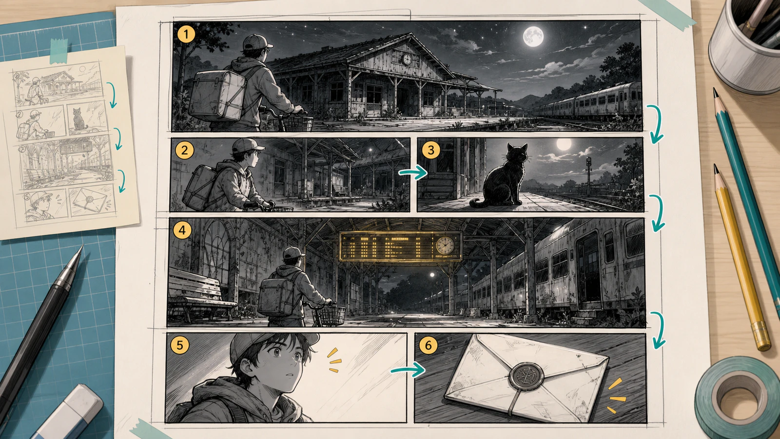
The layout works because panel size carries story weight: setup, object, motion, reveal, reaction, and clue each have a different job.
A page can fail even when the panel order is correct. Text placement can still break the flow.
Before generating final art, decide the text job for each panel.
| Panel | Text job | Space to reserve |
|---|---|---|
| 1 | Short caption | Top-left sky or station sign area |
| 2 | No dialogue | Keep focus on envelope |
| 3 | Small sound effect or no text | Open corner near the gate |
| 4 | No dialogue | Let the reveal breathe |
| 5 | One reaction line | Above shoulder, not over face |
| 6 | No text | Let the visual clue end the page |
Beginners often overwrite comics. If the image already carries the beat, use less text.
Use a storyboard or layout prompt first.
Create a rough 6-panel comic layout plan for this scene.

Scene:
Nia, a bicycle courier, arrives at an abandoned train station after midnight with a sealed silver envelope. A stray station cat slips through the ticket gate. The platform becomes moonlit and impossible. The arrival board turns on and shows Nia's name with the word "Tomorrow." The silver envelope seal changes to match the board.

Layout rules:
- Panel 1 should be a wide establishing shot.
- Panel 4 should be the biggest reveal panel.
- Panel 6 should be a small dramatic insert of the envelope seal.
- Keep reader flow left-to-right and top-to-bottom.
- Reserve clean areas for captions or bubbles.
- Do not generate readable text inside the image.

Return:
1. Panel order.
2. Panel size.
3. Camera angle.
4. Main visual focus.
5. Text space note.
6. What changes from the previous panel.
This prompt helps the comic become a page before it becomes finished art.
Once the layout is approved, generate the page:
Create a clean manga-style 6-panel comic page.

Main character:
Nia is a 17-year-old bicycle courier with short athletic build, black chin-length bob haircut, two small silver hair clips on the right side, small bandage on left cheek, teal courier jacket over cream hoodie, compact backpack, dark shorts over leggings, yellow sneakers. She carries a silver envelope and rides a red bicycle.

Panel layout:
1. Full-width top establishing panel: abandoned station at midnight, Nia arrives by bicycle.
2. Middle-left panel: Nia holds the silver envelope near the locked ticket gate.
3. Middle-right small panel: a stray cat slips through the gate.
4. Wide lower-middle reveal panel: moonlit platform appears beyond the gate.
5. Bottom-left reaction panel: arrival board glows behind Nia.
6. Bottom-right insert panel: the envelope seal changes to match the board symbol.

Style:
Clean manga linework, clear panel borders, readable left-to-right flow, cozy mystery atmosphere, strong lighting contrast.

Important:
Reserve areas for later captions and speech bubbles. Do not create readable text, logos, watermarks, or fake letters.
The first layout pass failed in four ways:
| Problem | What happened | Fix |
|---|---|---|
| No establishing shot | The page opened with a close-up envelope. | Make panel 1 a wide station shot. |
| Equal panel sizes | Every beat felt equally important. | Make panel 4 the largest reveal. |
| Confusing order | The cat panel visually pulled the eye before panel 2. | Move the small action panel to the right of panel 2. |
| No text room | Faces and props filled every corner. | Add negative space notes to panels 1 and 5. |
The page looked dramatic, but the reader flow was weak. That is exactly why layout needs its own pass.
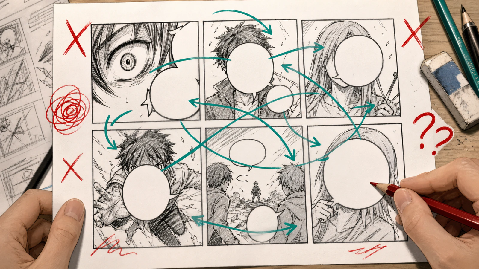
This is the failure mode to avoid: the page has images, but the reader path and bubble space fight against the story.
Use a targeted layout repair:
Repair the layout only.

Keep the same scene, character, style, and six story beats.

Required changes:
- Panel 1 must be a full-width establishing shot of the abandoned station.
- Panel 4 must be the largest reveal panel showing the moonlit platform.
- Panel 6 must be a small insert of the envelope seal.
- Keep reader flow left-to-right and top-to-bottom.
- Add clean negative space for one caption in panel 1 and one small reaction bubble in panel 5.

Do not add readable text. Do not redesign Nia. Do not change the story order.
This works better than saying "make it better." It tells the system which part of the page is broken.
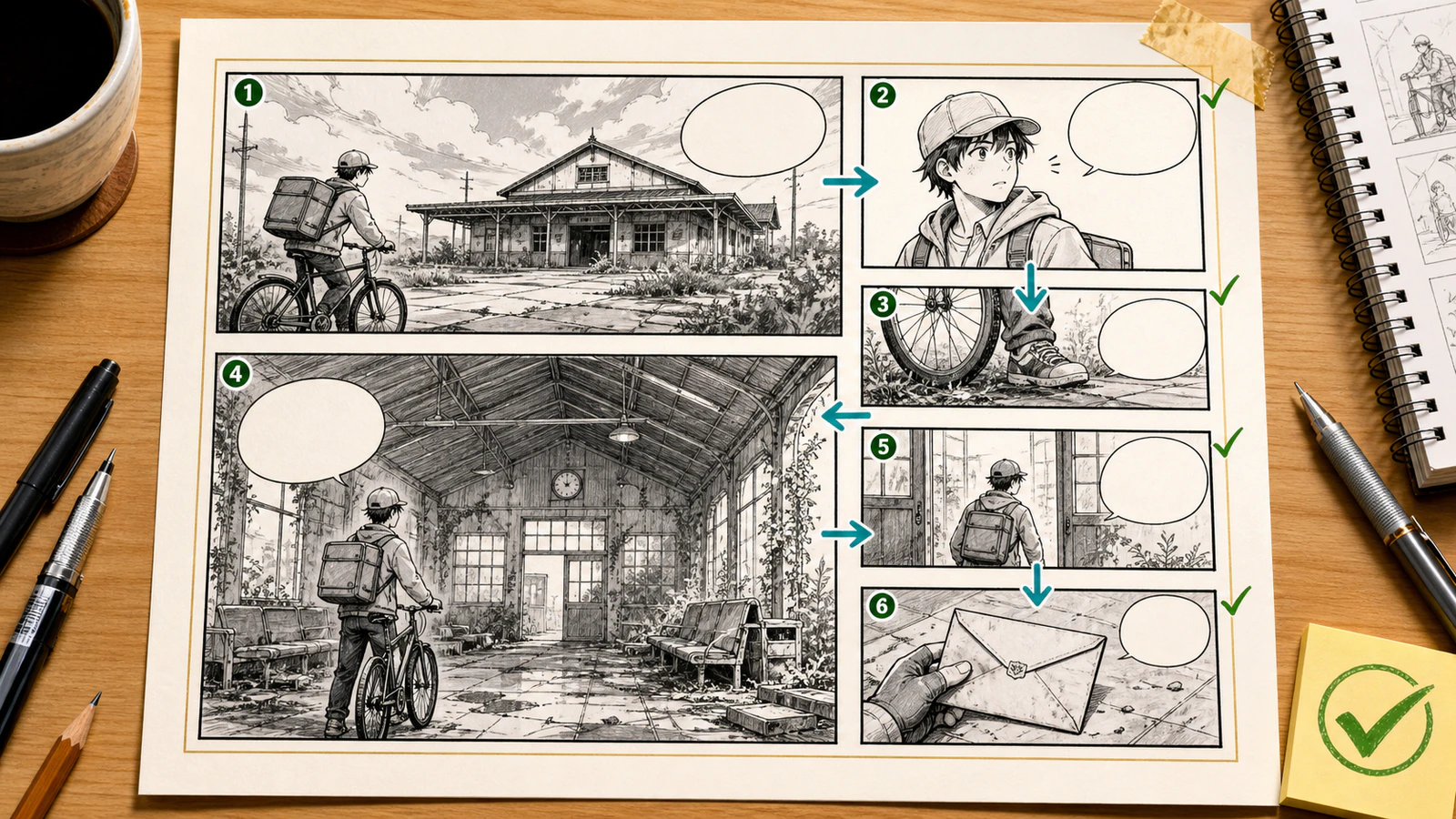
The repaired version gives the reader one route through the page and keeps text space away from faces, props, and the final clue.
Use this before publishing:
| Check | Pass |
|---|---|
| First panel orients the reader | Location, time, and main character are clear. |
| Each panel changes something | No duplicate reaction panels unless pacing needs silence. |
| Important beat is largest | Reveal, action, or emotional turn gets visual weight. |
| Reader path is obvious | Eye moves in the intended order. |
| Text has room | Bubbles do not cover faces, hands, or clues. |
| Close-ups have context | Reader knows where the character is before tight shots. |
| Final panel lands | The last image creates a joke, question, clue, or turn. |
| Mobile size works | The page is readable on a phone without zooming too much. |
| Panel size | Use when | Avoid when |
|---|---|---|
| Wide | Establishing location, reveal, transition | The beat is only a small reaction |
| Tall | Height, falling, vertical webtoon rhythm | The action moves sideways |
| Small | Insert, sound beat, quick reaction | The reader needs to inspect details |
| Close-up | Emotion, clue, decision | The reader does not know the setting yet |
| Silent panel | Tension, comedy pause, emotional breath | You are hiding missing story logic |
Panel size creates meaning. Use it deliberately.
Layout and character consistency support each other.
If you create character notes first, the layout prompt can focus on story flow. If you skip character notes, the layout prompt has to solve too many problems at once.
Use this order:
character lock -> beat map -> thumbnail layout -> comic page -> lettering -> repair
For the character side of the workflow, use the comic character consistency checklist before generating a full page.
Start with 4 to 6 panels. That is enough for setup, action, reaction, and reveal without overwhelming the page.
No. Many strong comic pages use silent panels for atmosphere, reaction, or timing. Add text only when it changes what the reader understands.
Yes. A storyboard plans visual beats and camera decisions. A comic layout also has to handle page rhythm, panel borders, bubbles, captions, and reading order.
Start in the LlamaGen.AI AI storyboard generator, approve the beat order, then move into LlamaGen.AI comic generation for the final page.
For beginners, use this repeatable layout chain:
scene -> format -> beat map -> thumbnail layout -> text space -> generated page -> layout repair -> export
The goal is not a prettier grid. The goal is a page a reader can follow without needing you to explain it.
Popular creator tools
Go from comics and storyboards to stylized photos with LlamaGen.
© 2026 LlamaGen.Ai All rights reserved
Leading the Future of AI Comic Generation