The viewer may be walking past a subway wall, riding in a car, entering a mall, standing in an elevator, or glancing at a digital screen across the street. They may have one second, three seconds, or a single glance from an awkward angle.
That changes how you storyboard the ad.
This is Day 3 of our advertising storyboard series.
Turn an outdoor ad idea into a storyboard people can understand in 3 seconds.
For billboard work, the storyboard is not only about frames. It is also about distance, scale, environment, contrast, movement, memory, and the one thing the viewer should carry away.
What Is a Billboard Storyboard?
A billboard storyboard is a visual plan for an outdoor advertisement.
It shows how the ad will be understood in context:
What the viewer sees first
How the main visual reads from a distance
Where the product or offer sits
How much text appears
Whether the brand is visible enough
How the ad works in a street, transit, retail, or digital outdoor environment
What changes across sizes and placements
What the viewer should remember after a quick glance
A billboard storyboard can be a single frame, but the most useful version often includes variations such as:
Close view
Far view
Street view
Mobile photo view
Night view
Cropped digital screen view
Transit wall or mall display view
Alternative headline or product placement
The goal is not to create a perfect final mockup immediately.
The goal is to test whether the ad survives real viewing conditions before buying media, producing assets, or presenting the concept to a client.
Why Billboard Storyboards Are Different
Video ads can build meaning over time.
Billboards usually cannot.
A billboard often has to work almost all at once:
One main visual
One message
One brand cue
Endringslogg
Tenn drømmer hos de unge Der millioner av historier blir levende
En oversikt over de nyeste funksjonslanseringene i LlamaGen, produktforbedringer, designoppdateringer og viktige feilrettinger.
✦
✧
✦
✧
Et nytt medium for Historiefortelling
Skap ubegrensede historier, tegneserier, animasjoner, spill og mer på sekunder som treffer moderne publikum
One action or memory
That does not mean every billboard must be plain. It means every visual choice needs a clear job.
Outdoor ads also compete with the real world. Buildings, cars, signs, windows, trees, shadows, reflections, pedestrians, and screen glare all affect readability.
A billboard storyboard should answer practical questions early:
Can someone understand this while moving?
Does the headline still read from across the street?
Is the product large enough?
Does the background reduce contrast?
Will a cropped version still work?
Does the ad make sense without a paragraph of explanation?
Is the CTA realistic for the placement?
If the answer is unclear in the storyboard, the final media buy will not fix it.
The 3-Second Rule
For outdoor ads, use the 3-second rule:
If the viewer has only 3 seconds, what do they understand?
This does not mean every placement gives exactly three seconds. A highway board may get less. A subway wall may get more. A mall screen may repeat. But the rule is useful because it forces the concept to become simple.
In three seconds, the viewer should understand at least three things:
Element
Question
Example
Hook
What catches the eye?
A giant product, unusual scene, bold contrast, surprising expression
If the viewer needs to read three lines before understanding the ad, the billboard is probably overloaded.
A Simple Billboard Storyboard Formula
Use this formula before making the visual:
One audience + one situation + one visual hook + one message + one memory cue.
Example:
Busy commuters + morning station platform + giant coffee cup lighting up the scene + "Wake up faster" + brand color and cup silhouette.
Another example:
Marketing teams + city launch event + clean storyboard frames replacing messy campaign notes + "Plan the ad before the shoot" + a clear visual storytelling workflow.
The formula helps prevent the idea from turning into a collage of competing elements.
Billboard Storyboard Template
Use this template when planning a billboard, transit ad, digital outdoor ad, or large-format display.
Logo area, color, product shape, mascot, style, URL
Helps recall after the glance
CTA
Visit, scan, search, download, enter, remember
Should match the placement
Variants
Landscape, portrait, square, digital loop, cropped transit panel
Outdoor campaigns rarely use one size only
Context mockup
Street, station, mall, vehicle view, night scene
Reveals whether the ad survives reality
Review test
1-second, 3-second, and 10-foot read
Finds overload early
For early planning, do not start with a polished layout.
Start with a visibility storyboard.
Visibility Storyboard Template
This version tests how the billboard reads at different distances.
Frame
View
Purpose
What to Check
1
Far street view
Does the ad stand out in the environment?
Contrast, silhouette, main visual size
2
Medium approach view
Is the message readable while moving?
Headline length, product clarity, brand cue
3
Close view
Does the layout still feel premium?
Composition, details, CTA, legal or URL
4
Cropped placement view
Does it survive alternate formats?
Safe zones, cut-off risks, logo placement
5
Night or glare view
Does lighting hurt readability?
Screen brightness, reflections, dark areas
6
Phone photo view
Would someone remember or share it?
Simplicity, visual hook, campaign memory
This is more useful than a single beautiful flat mockup.
A flat mockup can look strong in a design file and fail on the street.
Example: Billboard Storyboard for a Storyboard Tool
Here is a simple outdoor ad concept for a visual planning product.
One-sentence message:
Plan the ad before the shoot.
Audience:
Marketing teams, creators, agencies, and founders preparing campaign assets.
Main visual:
A messy campaign brief transforms into a clean row of storyboard frames.
Storyboard:
Frame
View
Visual
Message
Review Note
1
Far street view
Giant blank storyboard frames arranged in a clean sequence across the billboard
Planning before production
The frames must read as a sequence from far away
2
Medium view
One messy note cluster on the left becomes organized ad frames on the right
From idea to shot plan
Avoid tiny text on notes
3
Close view
Product workflow is implied through clean visual cards, not UI details
Make the concept visible
Do not rely on small interface screenshots
4
Digital screen crop
Same concept in vertical crop for a mall screen
Same idea, different format
Keep main visual centered
5
Night mockup
Billboard glows against a city background
High contrast and memory
Check dark areas and brand cue
6
Final review
One clear CTA area below or beside the visual
Start your storyboard
CTA should not compete with the hook
Notice the discipline:
The concept uses one transformation.
The storyboard tests real placements.
The product is suggested through workflow, not tiny UI.
The copy is short.
The visual remains clear without a long explanation.
That is what a billboard storyboard should do.
How to Build a Billboard Storyboard Step by Step
Step 1: Choose the Placement First
Do not start with the artwork.
Start with the viewing context.
A highway board, subway poster, mall digital screen, and airport display are not the same media problem.
Ask:
Is the viewer walking, driving, waiting, or browsing?
How far away are they?
How fast are they moving?
Is the ad horizontal, vertical, square, or irregular?
Is the environment visually crowded?
Is the placement static or digital?
Will the ad be seen in daylight, at night, or both?
The placement determines the storyboard constraints.
Step 2: Write the One-Glance Message
Write the message as if the viewer gets only one look.
Use this format:
When viewers glance at this ad, they should understand: [one idea].
Examples:
When viewers glance at this ad, they should understand: this coffee makes mornings feel easier.
When viewers glance at this ad, they should understand: this app turns campaign ideas into clear storyboards.
If the sentence contains three ideas, split it.
A billboard cannot carry the full sales page.
Step 3: Pick a Visual Hook
The visual hook does most of the work.
Good billboard hooks are readable as shapes before they are readable as details.
Possible hooks:
Oversized product
Strong silhouette
Before-and-after contrast
Visual metaphor
Human expression
Clean transformation
Unexpected scale
Bold color contrast
Negative space
Repeated pattern with one disruption
Simple object in a strange context
Weak hooks usually depend on tiny details:
Small UI screenshots
Dense product grids
Tiny testimonials
Multiple characters doing different things
Fine texture
Long captions
Complex diagrams
If it disappears at a distance, it is not a billboard hook.
Step 4: Place the Product or Brand Cue
Billboard creatives often overcorrect toward cleverness.
Clever is useful only if the viewer remembers what the ad was for.
Plan where the brand cue appears:
Logo area
Product silhouette
Brand color block
Package shape
Mascot or character
URL or search phrase
App icon or product card
For many outdoor ads, the brand cue should stay simple and consistent across placements.
Step 5: Limit the Words
The fewer words you use, the harder each word must work.
Use this early text test:
Can the headline be understood from 30 feet away?
Can the ad still work if the viewer reads only the biggest words?
Can the product be understood without reading a paragraph?
For many billboard concepts, one short headline plus one small support line is enough.
If you need more explanation, the outdoor ad may be pointing to a landing page rather than trying to be the landing page.
Step 6: Storyboard the Environment
Do not show the ad only on a clean white canvas.
Show it inside the real environment:
City street
Highway approach
Subway corridor
Train station wall
Mall atrium
Elevator screen
Airport display
Retail shelf screen
Event venue wall
Night street with glare
The environment makes weaknesses visible.
A layout that looks elegant in isolation may lose contrast when surrounded by lights, windows, and other signage.
Step 7: Make Format Variants
Outdoor campaigns usually need variants.
Create storyboard frames for:
Wide billboard
Tall digital panel
Transit poster
Square social teaser
Cropped mobile preview
Animated digital loop
Close product detail
Long-distance view
The campaign should feel like one idea, not separate ads competing with each other.
AI Prompt for a Billboard Storyboard
Use this prompt when you want an AI storyboard workflow to create outdoor ad concepts and placement tests.
Create a billboard storyboard for an outdoor advertising campaign.

Product or offer:
[Describe the product]

Audience:
[Describe the viewer]

Placement:
[Highway billboard / city street billboard / subway wall / mall digital screen / elevator screen / airport display / event wall]

One-glance message:
[The single idea viewers should understand in 3 seconds]

Visual hook:
[Describe the main visual idea]

Brand cue:
[Logo area, color, product shape, URL, app icon, or memory device]

CTA:
[Search, visit, scan, download, start, remember, or no CTA]

Storyboard requirements:
- Create 6 frames.
- Frame 1: far environment view.
- Frame 2: medium approach view.
- Frame 3: close layout view.
- Frame 4: cropped variant.
- Frame 5: night or glare test.
- Frame 6: final approved design direction.
- Include visual action, composition notes, readability notes, and production notes for each frame.
- Keep the message understandable in 3 seconds.
- Use one main visual idea.
- Keep text minimal.
- Avoid tiny UI screenshots, dense paragraphs, fake logos, unreadable text, random typography, watermarks, and decorative clutter.
- Make the ad work at distance and in a realistic outdoor environment.

Output format:
Frame 1:
- View:
- Visual:
- Composition:
- Message:
- Readability check:
- Production note:
This prompt helps the AI generate a storyboard, not just a single billboard image.
Image Prompt for a Billboard Storyboard Cover
For blog covers and concept art, avoid asking the image model to create headline text. It may invent broken letters or fake brand marks.
Use a visual-only prompt:
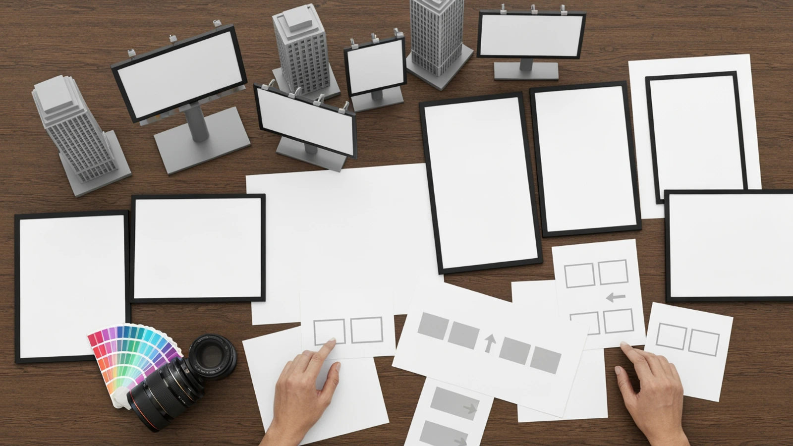
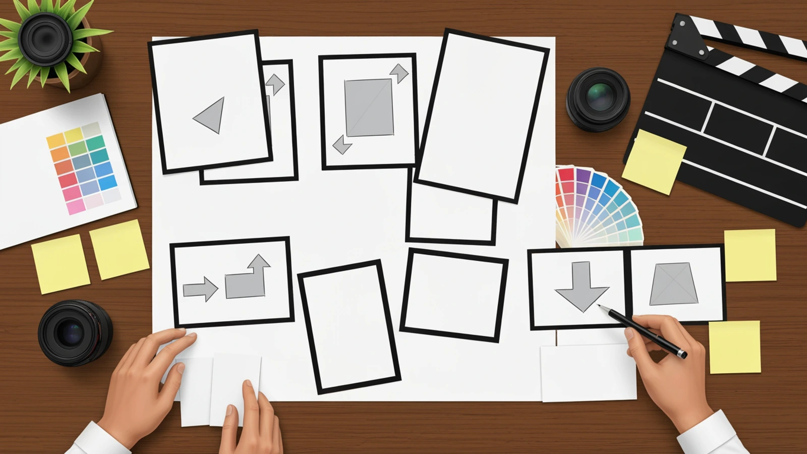
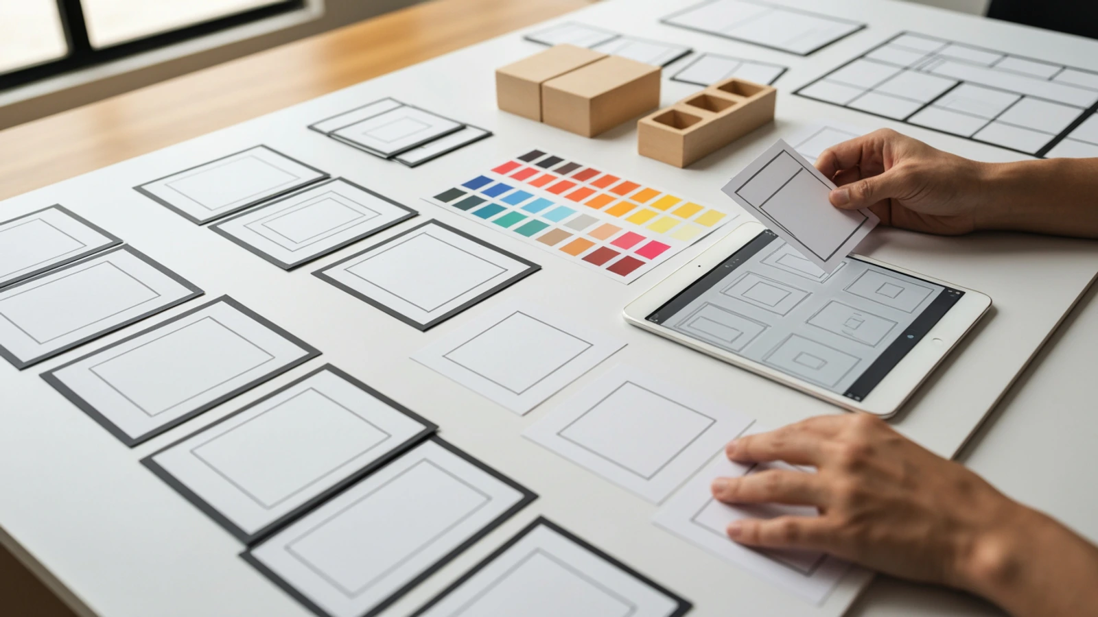
16:9 premium realistic editorial photography, no text and no typography anywhere. A creative advertising planning table for a billboard storyboard: miniature city street model, blank outdoor billboard mockups, empty transit poster frames, color swatches, camera lens, clean storyboard cards with only abstract shapes and arrows, hands arranging outdoor ad variants. The scene shows planning an outdoor billboard campaign that must be understood in 3 seconds. Absolutely no words, no letters, no logo, no watermark, no title overlay, no captions, no barcode, no fake UI, no readable writing on any object. Natural studio light, high-end agency pre-production mood, crisp details, clean focal hierarchy, realistic photography, responsive crop safe.
The same best practices from Day 2 apply here:
Ask for visual evidence, not text.
Repeat "no text" and "no logo" clearly.
Use blank mockups and abstract marks.
Keep the subject specific to the article.
Avoid fake UI and fake brand assets.
How LlamaGen Fits the Workflow
Billboard planning is a visual storytelling problem, even when the final ad is static.
The storyboard needs to show:
The core visual idea
The environment
The viewing distance
The message hierarchy
The brand cue
The format variants
The final production handoff
LlamaGen.AI is useful here because it supports sequential visual workflows: storyboards, scenes, panels, editable frames, captions, consistent visual direction, export, and production review.
Instead of generating one isolated billboard image, you can plan the campaign as a sequence of review frames:
Far view -> approach view -> close view -> crop variant -> night test -> approved direction.
Use the prompt above to generate a first pass, then revise the frames that fail the 3-second test.
Billboard Storyboard Checklist
Before approving an outdoor ad storyboard, run this checklist.
Message
The ad has one main idea.
The message is understandable in 3 seconds.
The visual hook does not depend on tiny details.
The product or offer is clear.
The brand cue is visible enough.
The CTA matches the placement.
Readability
The headline is short.
Important text is large enough.
Contrast works from far away.
The layout survives a quick glance.
The ad still makes sense without reading small copy.
The main shape is recognizable at a distance.
Environment
The storyboard includes a real context mockup.
The ad works in daytime.
The ad works at night or on a digital screen.
Crops and safe areas are checked.
The background does not swallow the product.
The placement does not hide the CTA.
Production
Required format sizes are listed.
Static and digital versions are separated.
Final assets have enough resolution.
Brand colors and product rules are noted.
Legal or QR code requirements are realistic.
The production team can recreate each variant.
Review
The team tested 1-second, 3-second, and 10-foot reads.
Stakeholders reviewed the ad in context, not only on a white canvas.
Weak variants were removed.
The final direction can be explained in one sentence.
The approved storyboard can be handed to design or media production.
Common Billboard Storyboard Mistakes
Mistake 1: Treating the Billboard Like a Web Page
A billboard is not a landing page.
Do not try to include every feature, benefit, testimonial, badge, and CTA. Outdoor ads should build attention and memory. The landing page can carry the detail.
Mistake 2: Making the Product Too Small
If the product is the reason to care, it should be visible.
A beautiful lifestyle scene with a tiny product can become invisible in real placement.
Mistake 3: Relying on Clever Copy Alone
Copy can be powerful, but outdoor ads are visual first.
If the line requires slow reading or cultural explanation, it may fail in motion. Pair the line with a visual that carries the idea.
Mistake 4: Forgetting the Environment
Billboards live in messy places.
Always storyboard the ad in context:
Surrounded by traffic
Near other signs
In shadow
In bright sun
On a screen with glare
In a corridor where viewers move fast
Context is not decoration. It is part of the test.
Mistake 5: Designing One Perfect Size
Campaigns spread across formats.
A wide board may become a vertical screen. A transit poster may become a social teaser. A digital billboard may need animated frames. If the idea collapses when cropped, the storyboard should reveal that early.
Outdoor Placement Notes
Highway Billboard
Use the fewest words and the largest shapes.
The viewer may be moving quickly, so the ad needs a strong silhouette, a large product, high contrast, and a message that reads almost instantly.
City Street Billboard
Pedestrians and drivers may both see it.
You can use slightly more nuance than on a highway board, but the street is visually crowded. Storyboard from across the street, from sidewalk distance, and from a mobile photo angle.
Subway or Transit Wall
Viewers may have more dwell time, but the environment can be cluttered.
Use the storyboard to test whether the main message reads from platform distance and whether secondary details help or distract.
Mall or Retail Digital Screen
The viewer may be browsing.
Product clarity matters. Consider digital loops, motion cues, and how the ad looks near store signs or other screens.
Elevator Screen
The viewer is close, but the screen may be small.
Use a simple visual, short copy, and a clear CTA. A dense layout feels cramped quickly.
Airport or Event Wall
The audience may be in a business or travel mindset.
The storyboard can use more brand atmosphere, but the one-glance message still matters.
How to Present a Billboard Storyboard to a Client
Do not present only the prettiest close-up.
Present the concept in layers:
One-sentence campaign idea
Flat layout view
Far environment view
Medium approach view
Close view
Cropped variants
Night or digital screen test
Final production notes
This makes feedback more useful.
Instead of asking:
Do you like this billboard?
ask:
Can you understand the idea in 3 seconds?
Is the product large enough?
Does the brand cue remain visible from far away?
Which variant feels strongest in real context?
What can we remove?
Good outdoor review is mostly subtraction.
Production Handoff Format
When the storyboard is approved, package it like this:
Campaign title:
Objective:
Audience:
Placement list:
One-glance message:
Main visual:
Headline:
Product or offer:
Brand cue:
CTA:
Required formats:
Static or digital:
Environment mockups:
Readability tests:
Asset requirements:
Legal or QR needs:
Open questions:
This turns the storyboard into a production tool.
The design team knows what to make. The media team knows which formats are needed. The client knows what was approved. The creative team knows what the ad must not lose.
Final Takeaway
A billboard storyboard is not just a large design preview.
It is a 3-second comprehension test.
It turns:
Let's make an outdoor ad.
into:
Here is the one thing viewers see, the one thing they understand, and the one thing they remember.
That clarity is what makes outdoor advertising work.
Use the template above to plan your next billboard or OOH campaign. Then bring the idea into LlamaGen Storyboard, generate far-view and close-view frames, test the 3-second read, revise weak variants, and hand off a cleaner outdoor ad storyboard.