

Manga art direction · Four formats · Updated November 2026
Choose your manga style: B&W, color, comics or webtoon
Style is more than a filter. It changes contrast, pacing, how dialogue reads and where a page feels finished. Use this guide to choose an art direction before you generate a chapter, then keep it stable across your book.
Four visual directions, one creative studio
These first-party catalog examples illustrate visual directions. They are not live outputs and do not promise identical results.

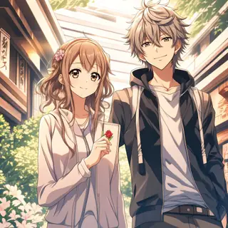

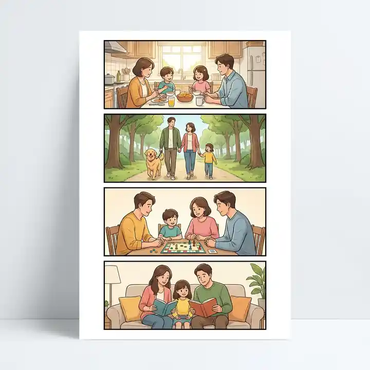
Black & white manga
Use for: Ink contrast, expressive faces, screentones and cinematic close-ups.
Review: Review lettering, tone separation and reading order at phone size.
Color manga
Use for: Manga framing paired with a consistent character and lighting palette.
Review: Color drift between locations, times of day and recurring costumes.
Western comics
Use for: Bold silhouettes, graphic shapes, dynamic panels and strong action beats.
Review: Overcrowded action panels and ambiguous speech-bubble sequence.
Webtoon
Use for: Vertical pacing, expressive reaction shots and deliberate scroll reveals.
Review: Tiny captions, broken visual rhythm and excessive gaps between beats.
1. Pick a reading format before an art style
Traditional manga and Western comics usually organize several beats on a bounded page. A webtoon uses the phone scroll itself for rhythm, reveals and breathing space. Decide whether your story should be read as pages, a continuous vertical strip, or both before designing panel order.
A page-first workflow suits print-like chapters and PDF review. Scroll-first pacing suits frequent close-ups, long pauses and episodic mobile reading. Reformatting after production can disturb panel balance and text size, so plan the destination early.
Before you continue
- Page-based or vertical reading
- Left-to-right or right-to-left dialogue order
- Phone or print-sized primary audience
2. Black-and-white manga: clarity through ink
Use strong light-dark separation, intentional negative space, ink textures and expressive faces. The limited palette keeps attention on gesture and composition. It suits suspense, action, quieter emotional beats and print-friendly chapters.
Prompt with concrete visual grammar: ‘high-contrast inked manga, controlled screentones, clean speech-bubble space, low-angle close-up.’ Then inspect whether backgrounds and costumes remain distinguishable in grayscale.
3. Color manga: emotion through a controlled palette
Color can clarify magic systems, environments, mood and character identity. Specify a palette for the story and stable accents for each lead character. Keep lighting changes motivated by the scene rather than accidental model drift.
A workable prompt might be ‘full-color manga, warm dusk lighting, deep blue jacket on the lead, cinematic panel framing, readable lettering area.’ Check adjacent scenes together to catch inconsistent color temperature or costume details.
4. Western comics: bold graphic storytelling
Comics often benefit from clear silhouettes, strong contour lines, vivid action poses and a deliberately designed page grid. They are a good fit for superhero-like energy, ensemble scenes and stories with fast physical motion—even if your subject is not a superhero.
Specify the action's direction and panel hierarchy. For example: ‘bold graphic-novel linework, three distinct panels, readable action geography, strong foreground silhouette.’ Avoid relying on generic ‘epic comic style’ alone; detailed staging gives you more useful review criteria.
5. Webtoon: compose for the vertical scroll
A webtoon moves through screens rather than isolated pages. Use generous negative space to create pauses, then compress the distance between panels for urgent exchanges. Reserve more vertical space for reveals and environment shots.
Write vertical beats explicitly: ‘phone-first webtoon, stacked cinematic panels, long vertical establishing shot, short dialogue, suspenseful scroll reveal.’ Preview at actual mobile width. A beautiful desktop collage may be exhausting to read on a phone.
6. Hold style steady across the chapter
Make a simple visual bible: line weight, saturation, reference palette, panel gutter, bubble shape and lettering rules. Use the same core terms in scene briefs and character references. Review three consecutive pages rather than approving each image in isolation.
The LlamaGen examples below demonstrate available visual directions, not guaranteed outputs for every account. Generation controls, number of pages, reference uploads and export formats should be checked in Mangaka before submitting a paid task.
Before you continue
- One reusable style brief
- Stable character cues and palette
- Three-page continuity and dialogue review
Bring the story to life
Your next manga starts here.
Put your creative brief into the real Mangaka workspace. Sign-in, plan eligibility and credit costs are shown before you commit to a generation.
Create in MangakaFrequently asked questions
What is the difference between manga and webtoon?
Manga commonly uses composed pages and a defined reading order; a webtoon is generally planned for vertical mobile scrolling. Either can use monochrome or color artwork.
Can I change the visual style later?
You can adjust creative direction in supported workflows, but large changes may require regenerating or editing pages. Confirm the controls and any credit charges in your account.
Which style works best for consistent characters?
No style guarantees identity consistency. Short, stable descriptions, approved references and cross-page quality checks matter more than selecting a single style label.
Does this guide guarantee every format can be exported?
No. The images show stylistic directions; available aspect ratios, page settings and export options depend on the current Mangaka experience and plan.